21
May 2017
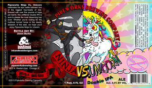
Unsolicited redesign: Ninja vs. Unicorn
A friend brought over some beer from Pipeworks Brewing a few weeks and I was so bummed when the label didn’t match the awesome potential of the name: Ninja vs. Unicorn.
I love anime, kung-fu, and magical horses with horns so I was really disappointed with the crowded, angry feeling of the design. I went for cleaner look, shapes without outlines, and an overall simpler feel.
Pipeworks + beer snobs, what do you think?

0 comments