6 weeks
Roles
UX research
UI
Interaction design
Branding
Deliverables
Market research
User research
Personas
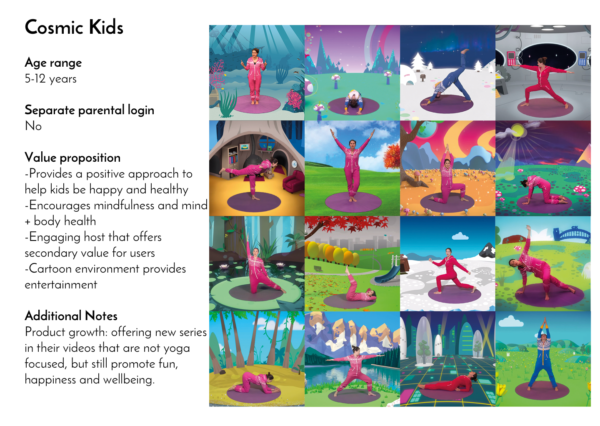
Competitive analysis
Paper concept prototype
Style tiles
Mid fidelity mockups
High fidelity prototype
Product roadmap
One-page website mockup
Tools
Affinity diagrams
Pencil and paper
POP
Axure RP
Sketch
Adobe Illustrator
Marvel
Flinto
InVision
Keynote

For our first team project at DESIGNATION we organized into teams and were presented with a challenge to create a digital product concept that reimagines how people can adopt and maintain a healthy lifestyle. While other teams conceptualized wearable tech, meet-up and social apps, we started by challenging the goals of the industry and it’s underserved markets.
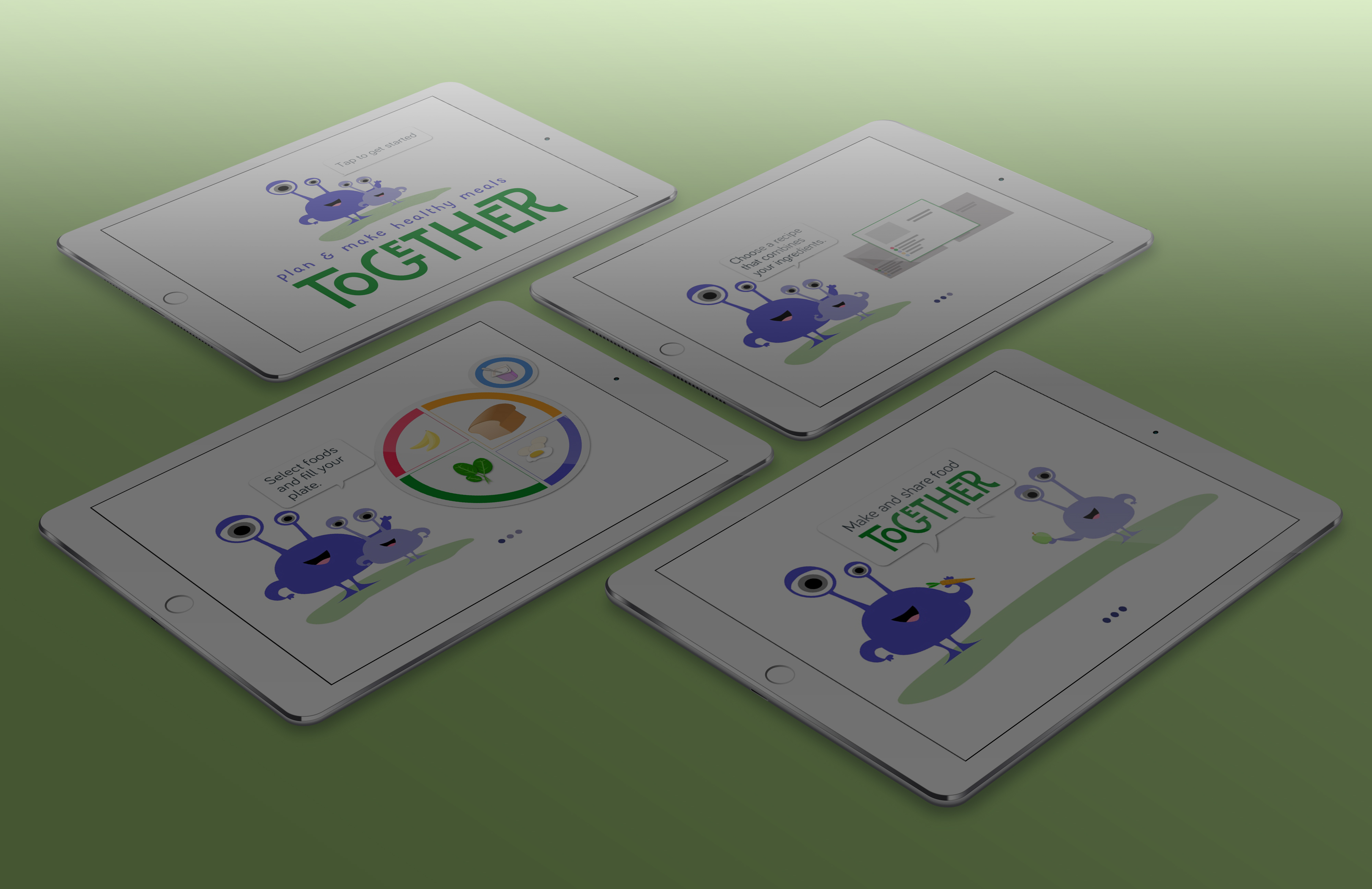
During three one week UX sprints and three one week UI sprints my team created Together. Designed to create shared parent/child experiences using native iOs devices, Together builds on nutritional concepts established in school to encourage healthy eating habits and nutrition based activities for families.
Approaching the market
Health & fitness is one of the biggest segments of the American consumer market. Everyday there are new ways to track what we eat and how much we exercise. New studies appear daily espousing the long-term benefits of a healthy lifestyle.
But, according to the CDC, almost 70% of Americans are overweight, including 35% that are considered obese.
If awareness and education about the importance of a healthy lifestyle are at an all time high why are 70% of Americans failing? Why do they continue new diet and exercise programs while their health suffers?
Using our personal and professional interest in behavioral research combined with overall health our team began researching the ways we could truly affect others and create real change.
Key insights
- Short-term change is affected by reward systems; longer-term is self-motivated
- Nutrition affects health more than exercise
- Ingrained habits are the most difficult to change
Narrowing the Scope
All the data suggested that the earlier you begin your journey to a healthy lifestyle, the more intuitive and easy it becomes. Instead of attempting to change learned unhealthy behaviors, we decided to work on ways to develop habits from a young age.
While defining our focus, my instinct was to move away from demographics that are traditionally targeted with new fitness products. In order for our team to differentiate we needed to focus on a ‘niche’ demographic.
Despite the potential challenges in finding users to test, I pushed our group to consider a a market that wasn’t urban 20-30 somethings.
Market Segmentation
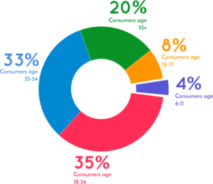
Products and services geared towards 3-11 year olds represent only 4% of the overall health and fitness market. This small segment of the marketplace was where we determined an application could have the largest impact.
Interviewing
In a series of nine interviews with parents and teachers of kids 3-12, we were able to develop insights about what these parents want. Most interviews were conducted over the phone, but some took the form of in-person interviews where we interacted with parents and children.
Sample Interview Questions
In your household what does diet mean?
If you had a magic wand and could change one thing what would it be?
Do you plan your meals? If yes, what does that involve?
What kind of incentives do you use to reward good behavior?
All interviews were conducted by 1-2 members of the team. One person would typically lead the interview while the other took notes and monitored the audio recording. Questions followed a pattern of drawing out biases through open-ended questions and asking off-script follow up questions when necessary.

Competitive Analysis
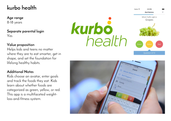
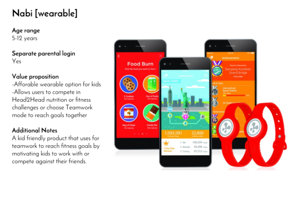
The fitness domain for kids, although much smaller than that of adults, contains a large variety of programs, digital solutions and technology to assist users on their road to health and fitness.
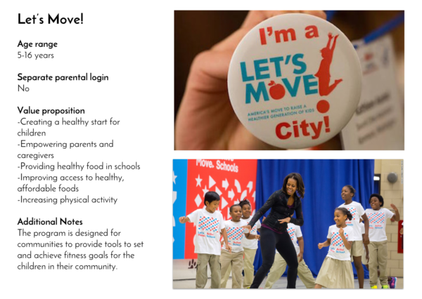
From the nationwide public initiative Let’s Move to videos designed for the classroom experience there are lots of options available.
Despite these existing solutions many parents we spoke to are still looking for one that focuses on teaching their kids lifelong health.
If I could change one thing, it would be how constantly busy we are. It is fun to participate in extracurricular activities, but we also need downtime as a family.
-Parent interview 3/14/16
At first when we stopped [allowing sweets in school] there was resistance. But now, it seems like they prefer fruit and nobody really misses it.
-Teacher interview 3/12/16
It’s really hard to limit screen time, and sometimes, I [regretfully] have to use it as reward.
-Parent interview 3/10/16
Using research to create a model
Combining our interview data and a snapshot of the domain we created preliminary questions for our concept to answer.
- What are ways to engage with their kids about health?
- How can an application balance screen time and the need for assistive technology?
- How can a tool provide an outside authority that users can modify to fit their parenting style?
In order to answer these questions we created two personas of users in the market that would benefit from a tech solution.
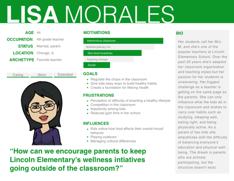
Mrs. Morales represents our edge case persona. She’s a favorite teacher and role model for elementary age kids. She has access to her students and insight into their daily activities and socialization.
While Mrs. Morales is a fascinating parent and teacher our team made the decision to work towards a solution that would provide more control over kids day-to-day activities. Constraints on access to classrooms that fit the profile led us in a different direction. If the project moves to a future iteration, further exploration of classroom integration would be especially compelling.
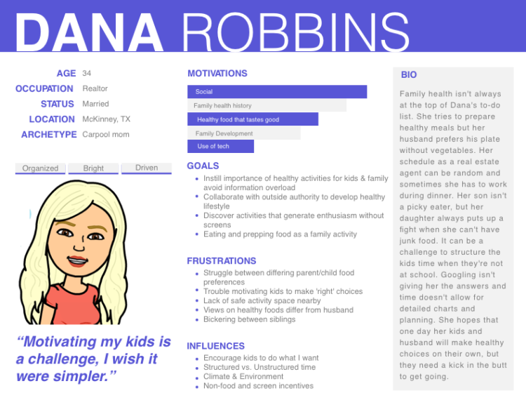
Dana’s biggest concern with kids health revolves around the dinner table. Her kids are busy moving & playing but she doesn’t want them to fuel themselves with potato chips and sugary beverages. She needs ways to encourage her family’s health but isn’t sure how to get started.
Dana is our core demographic. She’s every mom – overworked and under appreciated. Next, we used what we had built about Dana to explore one of her biggest daily struggles: how dinner gets on the table.
Dana works as a real estate agent and has a variable schedule but she makes time to be with her kids by volunteering as the carpool mom. Most of her days follow a predictable pattern – she tries to make healthy choices but whether she gives in or holds out, the family can’t seem to agree on the importance of preparing a healthy meal.
Can we provide a digital solution for parents like Dana who need a family fix for their dinners?
Empathize & Define
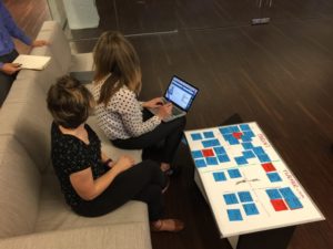
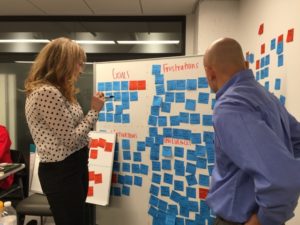
After synthesizing our research into an affinity diagram, which highlighted the interviewees goals, frustrations, motivations and influences, patterns started emerging.
Using what we had discovered and developed, we started defining our problem statement. The problem statement, along with the personas, would dictate the outcome of our final concept.
Parents like Dana know that long lasting healthy habits are difficult to establish when kids don’t feel involved. They need tools to involve and empower their kids without making anyone feel like the bad guy.
Having defined the problem for our core persona, we set up four principles around which to design our concepts. Our principles apply context to the needs of parents like Dana and while answering the questions from the previous phase.
Design Principles

Collaborative Mentoring
Helps parents and kids work together to stay on the same page in 1-on-1 situations–as well as when the whole family is involved.

Actionable Advice
The user receives recommendations that they can implement at home with standard tools.

Meaningful Empowerment
Creates value by providing relevant information to the user’s goal(s) with a modern look and feel that is easy to use.

Structured Assistance
Keeps the user on track by making them aware of their progress.
Our team explored the ways in which the domain wasn’t serving our Dana. A lack of awareness and time coupled with a reluctance to explore new ideas were all common barriers to getting the family motivated to make healthy lifestyle changes. After further defining the problem and the design principles to apply we began work on branding.
A theme in several interviews was doing things as a family unit. Naming the concept Together immediately resonated with the team. Given the role that parents have in establishing healthy habits and making those habits a family experience emphasized our value prop that healthy choices are easier and more intuitive the younger you start.
Next each member of our team began to ideate and create their version of Together.
“We go to the park, have playdates… [My husband] and I think that hanging out with the kids should be more than just watching videos on YouTube.”
-Parent interview 3/9/16
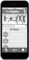
Together v1: quick activity prompts
Consideration of design principles
![]() Actionable advice: Prompts do not require equipment and are time considerate
Actionable advice: Prompts do not require equipment and are time considerate
![]() Collaborative mentoring: Mirroring user’s goals with activities that engage parents and kids.
Collaborative mentoring: Mirroring user’s goals with activities that engage parents and kids.
![]() Meaningful empowerment: Prompts encourage kids to draw conclusions about how what they’re doing impacts how they feel.
Meaningful empowerment: Prompts encourage kids to draw conclusions about how what they’re doing impacts how they feel.
![]() Structured Assistance: App provides progress benchmarking and rewards progress.
Structured Assistance: App provides progress benchmarking and rewards progress.
Using paper modeling the first prototype uses activity prompts targeted at parents to encourage their kids to engage in health and fitness activities.
Prompts come from three categories – fuel, learn, and move. Prompts are designed for kids to draw connections between activity and healthy eating and positive feelings of well being.
Concept Testing & Analysis
After creating a testing plan and having the concept vetted by potential users we compiled the following feedback.
What users liked
![]() Activities are quick and easy
Activities are quick and easy
![]() Family based projects
Family based projects
![]() App encourages participation with rewards
App encourages participation with rewards
What users wanted
![]() Improve clarity of application flow
Improve clarity of application flow
![]() Create/modify goals
Create/modify goals
![]() More visual content
More visual content
Using the feedback I learned that users had differing perceptions of the difficulty of tasks. Some users were excited to perform 30 seconds of calisthenics, while others were ready to turn the application off. These users wanted the ability to modify goals and suggested activities according to their own priorities.
Taking these inferences and insights I built the next iteration of Together using the Axure prototyping software to build a cleaner interface.
Moving forward with a concept
Each member of the team then presented feedback on their various concept and prototype. We worked to synthesize what worked, what didn’t, what features we were excited about and how we could create a product for a user like Dana.
Quick Activity Prompt
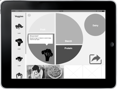
meal building with MyPlate
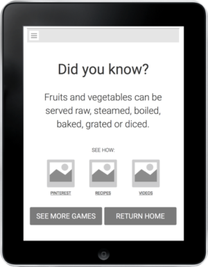
learning about health through gamification
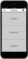
kid friendly cross fit style workouts
Our testing showed a great response to the MyPlate prototype. A concept that parents and children were familiar with and supported by many schools in the US, it was a great
The largest change from Together v1 was the incorporation of MyPlate, a nutritional concept taught in schools. Next up was building a fuller interactive prototype as a team.
Our new concept
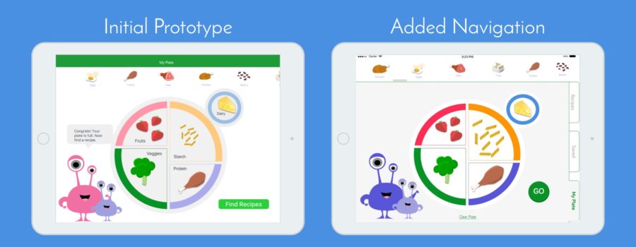
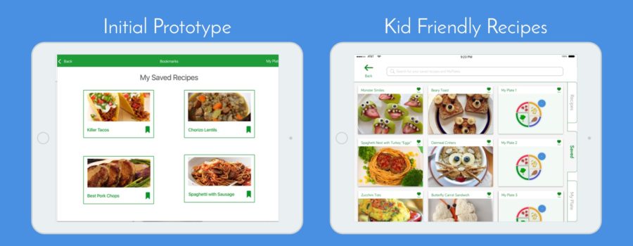
MyPlate is an initiative taught in public schools that illustrates the five food groups as a building block for a healthy diet using a plate as a basis. Together’s approach lets kids select foods from each food group and displays recipes using the foods as ingredients. The recipe features step-by-step instructions for kids and parents to prepare the meal together.
APPLICATION OF DESIGN PRINCIPLES
![]() Actionable Advice – Providing recipe suggestions while putting the ultimate control in the hands of parents.
Actionable Advice – Providing recipe suggestions while putting the ultimate control in the hands of parents.
![]() Collaborative Mentoring – Encourages cooking as a family using age-based suggestions with an emphasis on life vs. screens.
Collaborative Mentoring – Encourages cooking as a family using age-based suggestions with an emphasis on life vs. screens.
![]() Meaningful Empowerment – Kids and parents work together towards healthy eating goals.
Meaningful Empowerment – Kids and parents work together towards healthy eating goals.
![]() Structured Assistance – Using a kids guide, parents decide flow, allows families to create meals.
Structured Assistance – Using a kids guide, parents decide flow, allows families to create meals.
Branding & Visual Evolution
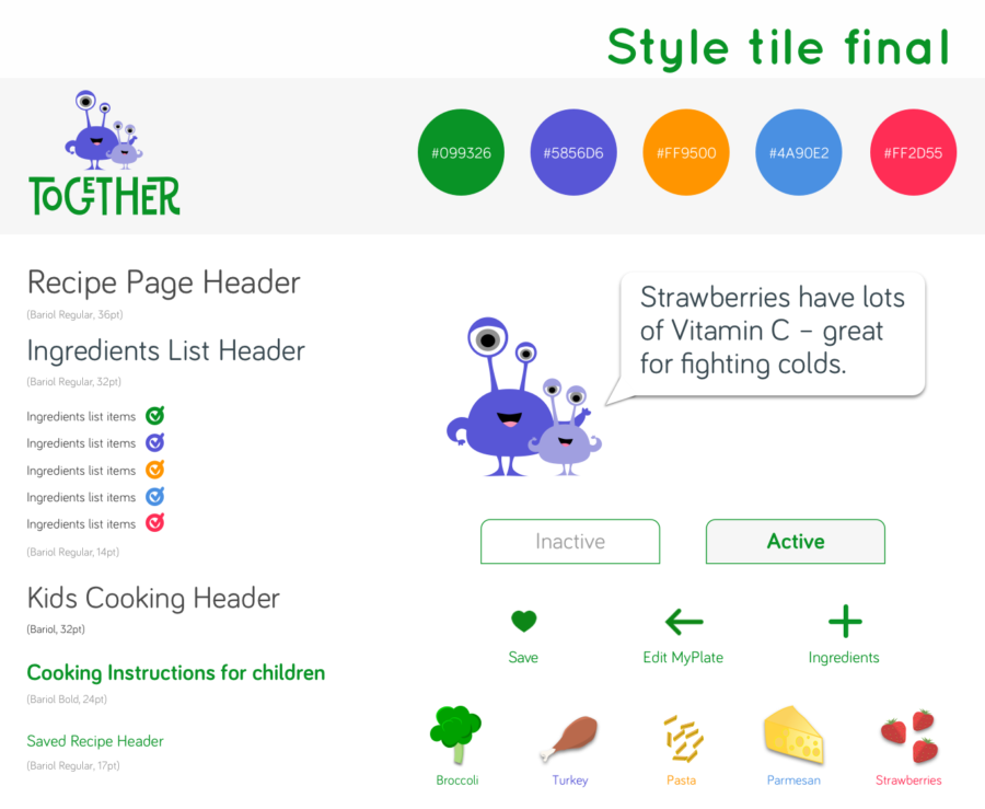
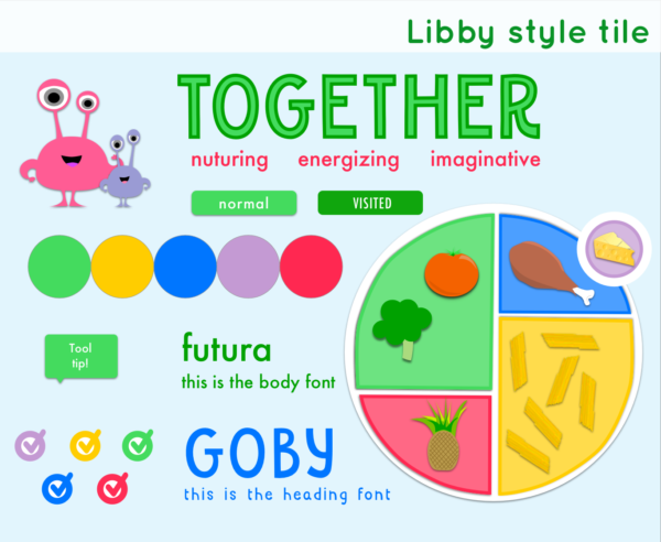
As we continued to improve the user flow of the application we also worked on the visual style. Each team member created style tiles that gave us a chance to explore different visual design directions before creating any hi-fidelity screens.
Style Considerations
Realism vs Illustration: While most recipe apps aimed at adults used real pictures of food, most apps aimed at the younger market featured illustrations and bright colors. I used illustrations in my style tile to keep it fun and kid friendly.
Mascot development: Aligning with the design principle of structured assistance, I designed a mascot to guide users through the experience. Toby is an alien-monster who is does not make a cultural or gender impression so the character is more relatable for all types of users.
Appealing to parents & children: Most kids apps are busy or cluttered. Most adult apps don’t feature cartoon guides. To split the difference I built a simple UI with illustrated components.
Hi-Fidelity Testing
Two rounds of user testing on our high fidelity prototype validated several of our concepts and provided valuable feedback.
It’s fun and my kids would love it … [But] when they’re chopping vegetables am I supposed to take the iPad away to see what I’m supposed to cook?
Interview feedback 4/7/16
USER FEEDBACK
![]()
Participants enjoyed the idea of using the app to interact in real life vs. interacting with a screen
![]() Parents were confused by how to split the flow of the application – when each family member was supposed to participate
Parents were confused by how to split the flow of the application – when each family member was supposed to participate
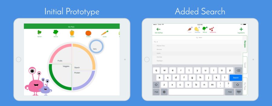
![]() When building the plate, participants wanted more food options and the ability to input their own choices
When building the plate, participants wanted more food options and the ability to input their own choices
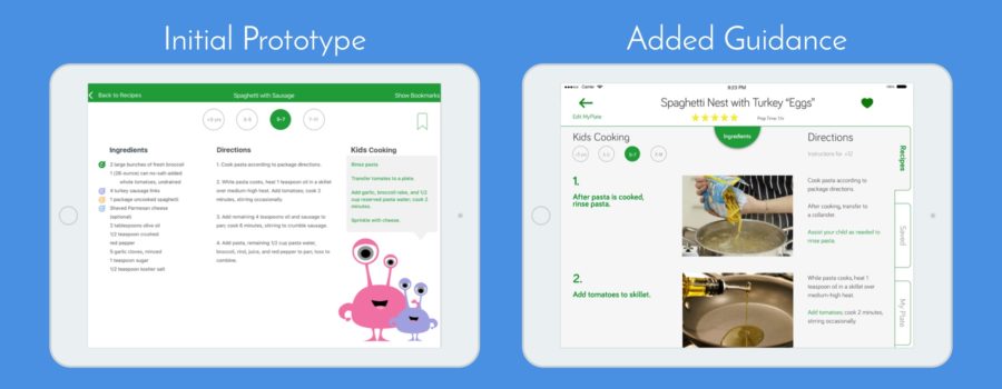
Using the feedback from testing we divided up the responsibilities and I focused on improving the flow for recipes. While updating the design principles and UI guidelines we set, I split the screen into two distinct sides for parents and kids. A pull-down menu was added for ingredients and images were added to help eliminate confusion. Videos could be added to recipes as well.
FINAL PROTOTYPE TESTING BLOCKER
I constructed a full version in InVision. The primary blocker in testing occurred when were unable to secure any users to test in the 3-12 age range. Because we were unable to find subjects that matched the demographic, some of our original concepts are still unvalidated.
APPLICATION OF DESIGN PRINCIPLES
![]() Actionable Advice – Healthy kid friendly recipe suggestions with ultimate parental control.
Actionable Advice – Healthy kid friendly recipe suggestions with ultimate parental control.
![]() Collaborative Mentoring – Provides variable age-based suggestions while encouraging cooking as a family and placing an emphasis on what’s going in outside of the screen.
Collaborative Mentoring – Provides variable age-based suggestions while encouraging cooking as a family and placing an emphasis on what’s going in outside of the screen.
![]() Meaningful Empowerment – Kids and parents work together to build a healthy plate, browse fun recipes, and prepare a meal together.
Meaningful Empowerment – Kids and parents work together to build a healthy plate, browse fun recipes, and prepare a meal together.
![]() Structured Assistance – Kids make the initial food selections and then parents guide the flow of selecting and creating a recipe. In context recipe suggestions also provide healthy tips.
Structured Assistance – Kids make the initial food selections and then parents guide the flow of selecting and creating a recipe. In context recipe suggestions also provide healthy tips.
Final feedback
For our final group presentation we were given feedback on our developed concept as well as our process. Overall, the main criticism concerned the application’s path. The separation of kid and adult flows still needs clarity for users and until we can test the product with actual parents and kids that remains our biggest roadblock.
Additionally, our group was commended on the products strong adherence to the design principles while working towards answering the problem statement and creating a product that meets the needs of our persona.
Brand expansion
Together as a concept has potential beyond a healthy cooking app for kids. With a marketable mascot and a positive message, our team believes that Together can help kids and families get in shape, learn and grow. Potential uses for Together technology include classroom integration and other places beyond the home.
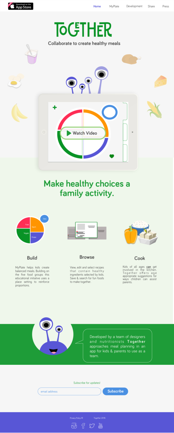
In order to attract new users to the product, I also made mockups of a mobile and desktop site to promote the Together app.
Final thoughts
This project did not have the traditional constraints a client brings to the design process. Beyond our brief, our app could take whatever form we chose.
By challenging ourselves to appeal to an underserved market, I believe we created a product that has real world value. Developing our design in an agile environment allowed us to ideate while changing direction throughout the process.
Challenging testing results led to new concepts and the ability to explore several prototypes. If given the chance to develop I believe questions concerning user flow could be answered with a voice activated component – such as Alexa or Google Home.
Overall, we created a fun, interactive product – one that has the possibility to help families explore better eating habits while creating shared experiences.
